Sheet 02 / 04
IndexMeridian
Your maturity model speaks in positions. Meridian is the coordinate system.
A design system built from scratch for a platform that plots global capability centres on a maturity model. Every colour step is solved to a contrast target rather than chosen, so the step number is a promise a designer can rely on.
- Client
- Zinnov
- Product
- GCC Intelligence Platform
- Year
- 2026
- Scope
- 382 variables · 240 components · 45 icons
- Role
- Sole designer, system and product
Impact at a glance
- variables across six collections
- 382
- ramps and steps, generated in OKLCH
- 10 × 11
- lines of generator code
- 892
- icons drawn on a 24 grid
- 45
The situation
Zinnov’s maturity model speaks in positions: Outpost, Satellite, Portfolio Hub, Transformation Hub. The platform that presents it needed a visual system those positions could be plotted on, and the file it had could not carry one.
The existing colours pointed straight at a single primitive. There was no way to introduce a dark mode, no way to retheme for a module, and no way to tell whether a given blue was decoration or carried meaning.
From the docs
Primitives are not for designing with. Nobody picks azure-600. They pick text/link, and the mode swaps underneath.
Before
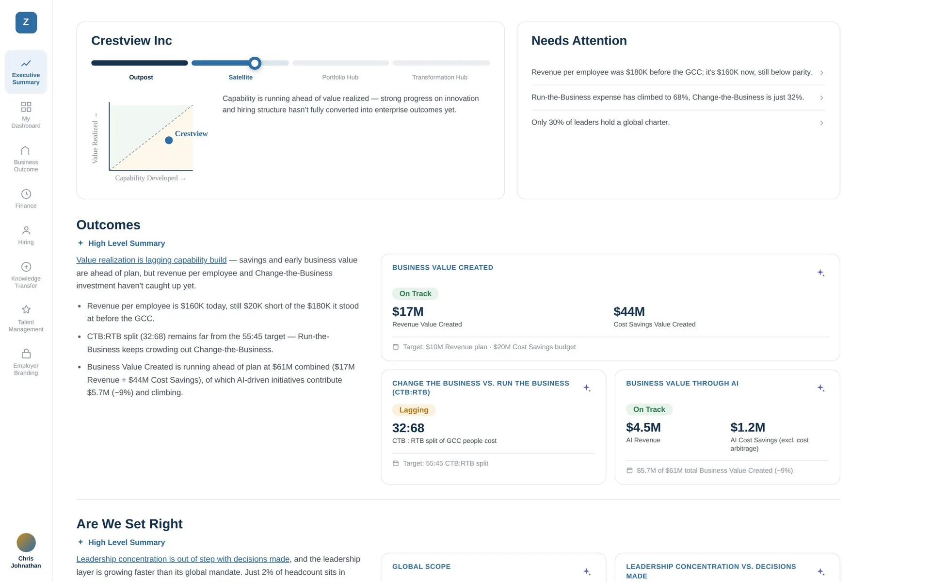
The existing Executive Summary is where both problems live. The colour problem, because every value points straight at one primitive and there is no tier a mode could swap. And the harder one, which is that a grid of equally loud tiles cannot express consequence.
Before · the Executive Summary today
After · the Brief
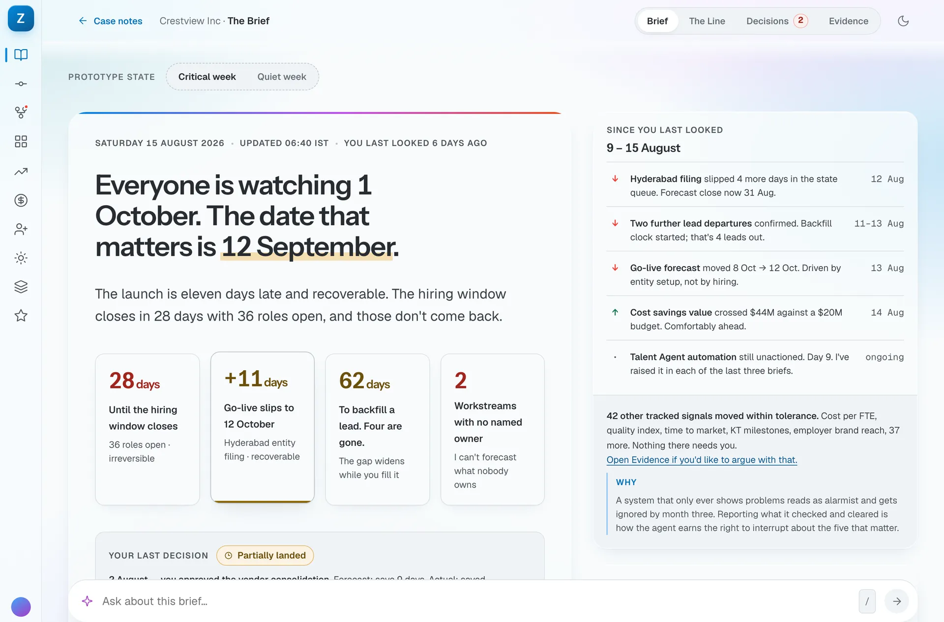
- Fourteen tiles, equal weight. Vendor spend and a closing hiring window are the same size, so nothing tells the reader which one expires.
- Status, not consequence. On track, at risk and behind describe a state. None of them says what it costs or what to do.
- The agent findings sit at the bottom. Four real, specific recommendations, each rendered as a notification with a button that goes nowhere.
- Red, amber and green give way to days, dollars and expiry dates, so the semantic layer only has to supply text, surface and one accent.
The method
Every step in every ramp is solved to a contrast target rather than picked by eye. Read down any column of the palette and the contrast ratio is identical across ramps. That is the system working, not a coincidence.
The step number carries the promise. A 600 clears AA for text in azure, amber,
teal and grey alike. A 500 clears 3:1 for non-text. Because the ramps are
generated in OKLCH, each step is a perceptually even move rather than an
arbitrary change in lightness.
Four surfaces, one token layer
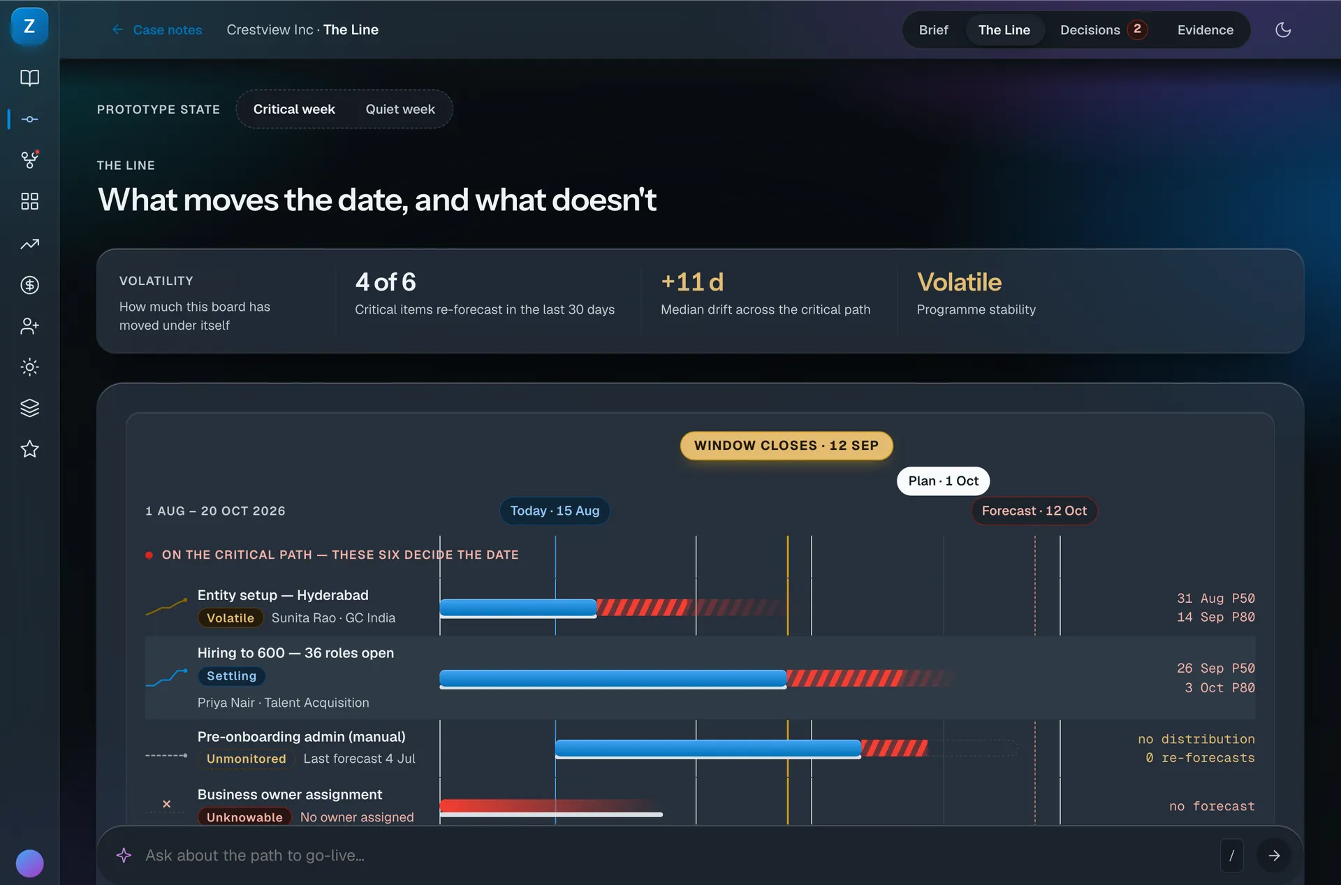
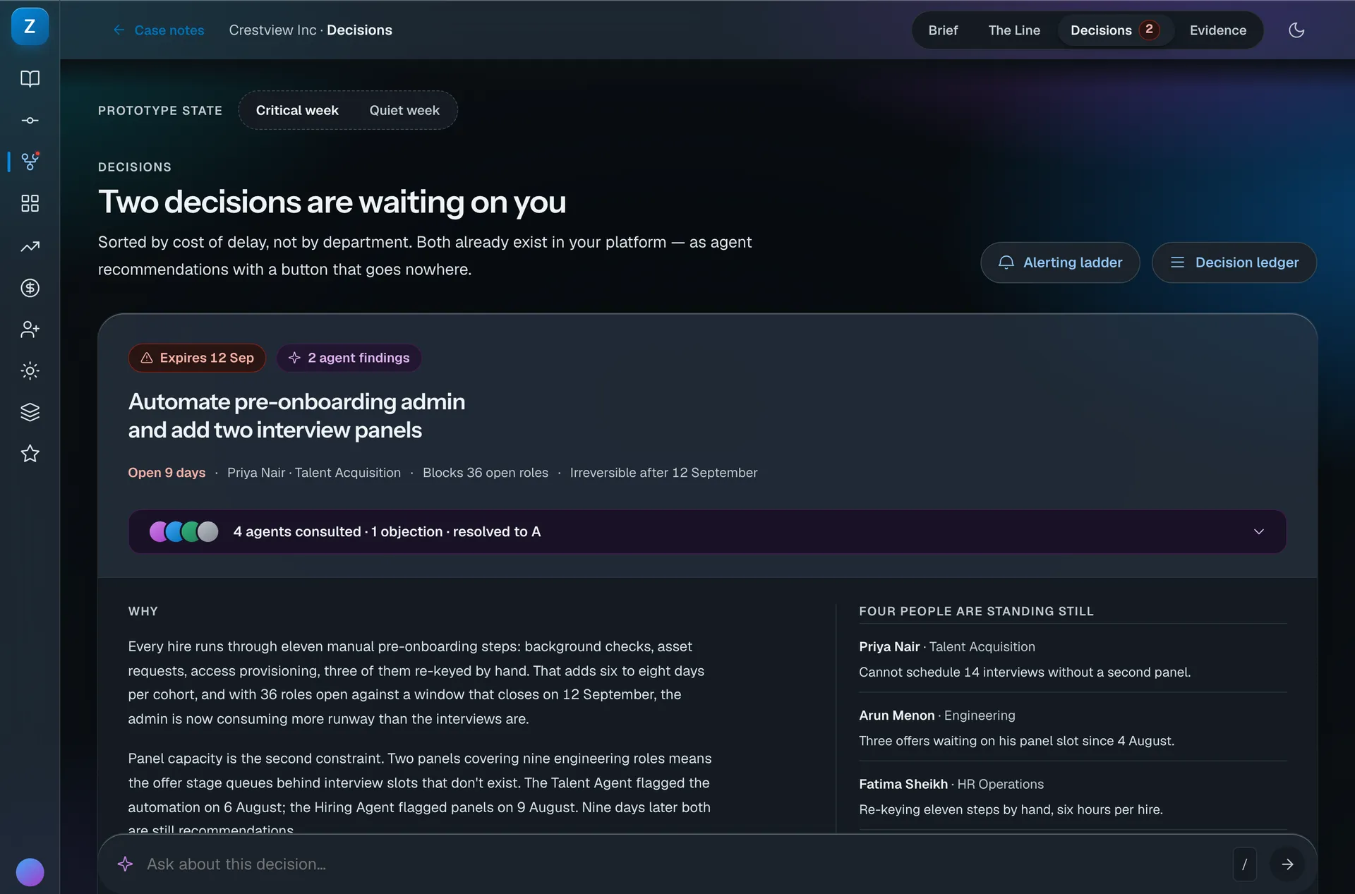
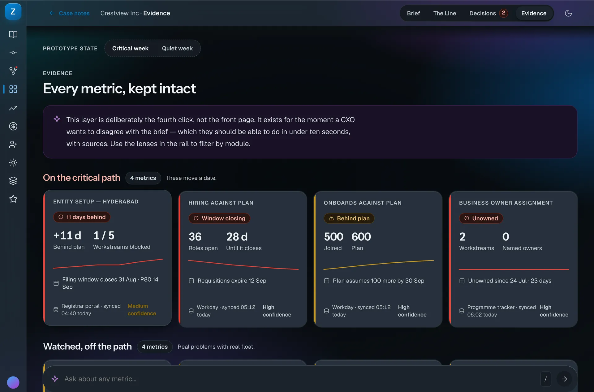
The system had to carry four surfaces that look nothing alike: a written brief, a forecast timeline, a decision queue and an evidence ledger. None of them declares a colour. Every one of them reads the same semantic layer.
The rules that explain most decisions
Seven rules do most of the work, and each one is testable rather than tasteful.
| Rule | What it decides |
|---|---|
| Controls are capsules, surfaces are rounded rects | Mixing the two makes a UI read as one system dropped inside another |
| Glass goes on chrome, never on content | Nav rail, top bar, modals, menus. Never metric cards, tables or charts |
| Colour steps are promises | A step number is a contrast guarantee, not a shade |
| Status is a whole-card treatment | A severity edge, a wash, a label in the status hue, a sparkline that agrees |
| Six chart colours, in fixed order | A seventh series folds into Other, or becomes small multiples |
| Nothing below 12px exists | Removing the token beats discouraging its use |
| An AI claim ships with its evidence | Otherwise it is an assertion in a nicer box |
The calls that could have gone another way
The part that breaks if you touch it
Glass opacity is solved, not styled. Each tier was derived by compositing the tint over the worst backdrop it can float over, then checking body text against the result.
Lower it because it looks nicer and the surface drops below AA with no visible symptom, until someone cannot read a toolbar. This is the one value in the system that should never be adjusted by eye.
How it stays maintained
Meridian is generated, not drawn, and that decides how it is maintained.
Nobody edits the stylesheet. The ramps come out of a generator that solves each step to a contrast target. If a value needs to move, the input to the generator moves and everything downstream is rebuilt. Hand-editing the output would break the promise the step numbers make.
The contrast check runs before the code is accepted, not after. A build that would emit a step below its target fails. That means the rule is enforced by the pipeline rather than remembered by a person. In a busy quarter, that is the only version that holds.
Changes arrive as a diff, with a reason. Every regeneration produces a readable change to the token file, so a reviewer can see that azure-600 moved and why. A colour change with no recorded reason is how a system loses its logic without anyone deciding it should.
One rule stays out of the pipeline’s hands. Glass opacity is solved against the worst backdrop, and it is the one value I ask people not to adjust by eye, because lowering it looks better right up until a toolbar becomes unreadable.
Dark is a different physics
Dark mode is a tier-two override. No component knows it exists.
Light · the default
Dark · a tier-two override
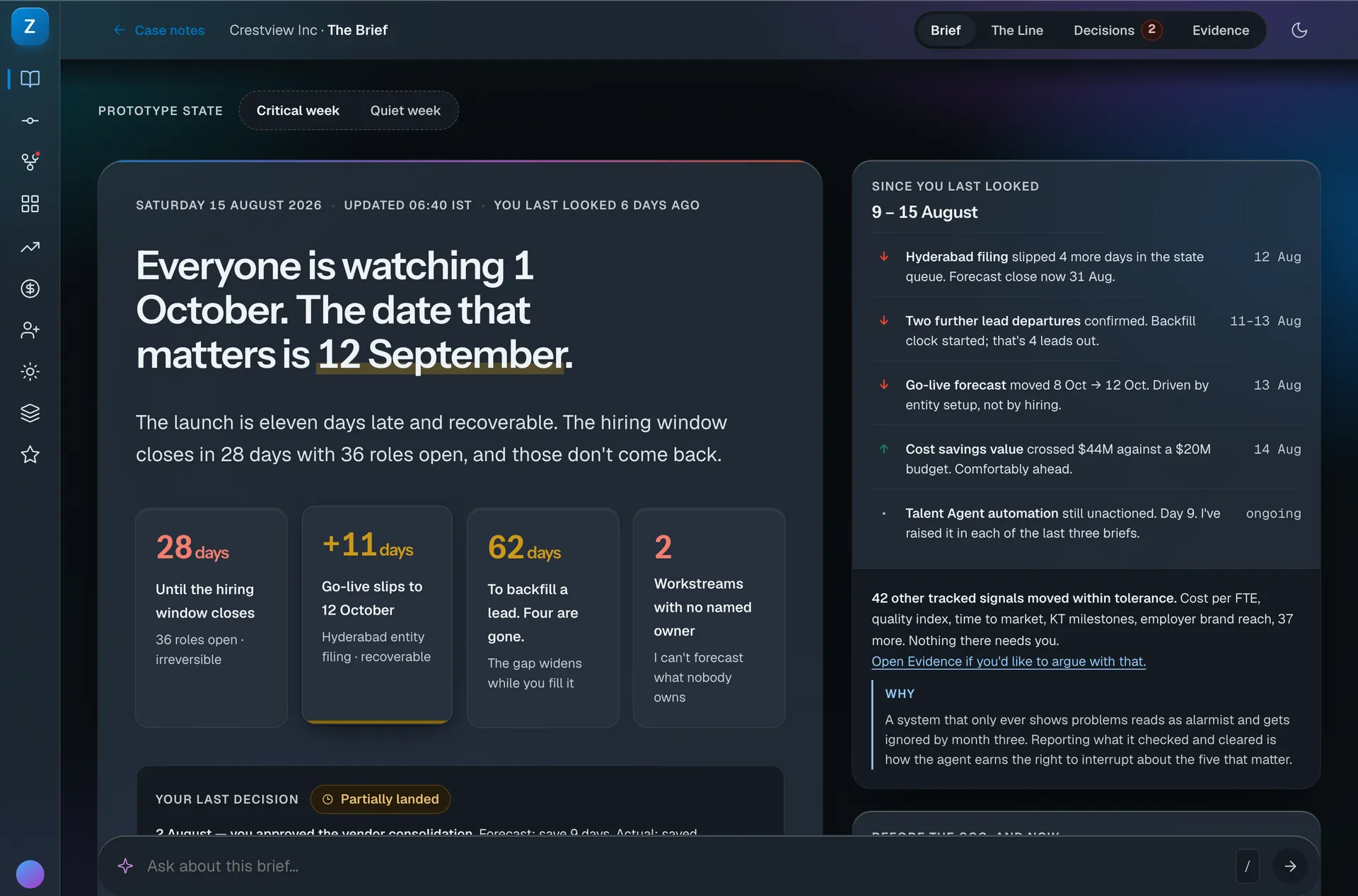
- Elevation stops being a shadow. There is nothing to cast one on black, so the card lifts by luminance and a lit top edge instead.
- The figures saturate rather than pale. A contrast ratio and a perceptual weight are not the same measurement.
- The warm highlight behind the key date drops in lightness and gains chroma, so it still reads as a highlight and not as a selection.
- Hairlines invert direction: a light rule on a dark surface, at a lower delta, because the eye finds edges more easily in the dark.
There is no shadow to cast on black, so elevation reads through a luminance lift and a lit edge instead. Large figures saturate rather than pale, because a contrast ratio and a perceptual weight are not the same measurement.
Revisions
- Δ1
- Palette regenerated in OKLCH, every step solved to a contrast target.
- Δ2
- Semantic tier added so no component references a primitive.
- Δ3
- Glass opacity solved by compositing against the worst-case backdrop.
- Δ4
- Chart set fixed at six colours, validated for three kinds of colour blindness.
- Δ5
- Sizes below 12px removed from the scale rather than discouraged.