Sheet 04 / 04
IndexTalabat Pro
One component, three outcomes, two writing systems, one thumb.
A progress bar docked to the basket that tells a Pro customer how far they are from free delivery. The interesting part is not the bar. It is the specification behind it: anatomy bound to named styles, spacing on a scale, motion written as a rate, acceptance criteria for every branch, and an Arabic mirror drawn beside the English.
- Client
- Talabat
- Product
- Pro free delivery, Delivery Hero
- Year
- 2023
- Scope
- 5 anatomy elements · 3 states · LTR and RTL · Flutter handoff
- Role
- Product designer, design system contribution
- Team
- Product manager, 4 engineers, content design
- Timeline
- 2023
- Status
- Shipped
Impact at a glance
- anatomy elements, each bound to a named style
- 5
- basket states, each with written acceptance criteria
- 3
- progress movement per dirham, specified as a rate
- 11.4px
- both writing systems drawn on the same sheet
- LTR + RTL
The problem the component solves
A Pro customer on a Pro restaurant gets free delivery, but only above a minimum order value. Below it, nothing on the menu tells them how close they are. The gap between having Pro and not currently getting the benefit is invisible, and it is invisible at the moment it matters most, while the basket is being built.
The answer is a progress bar docked to the basket bar, present on the menu rather than discovered at checkout.
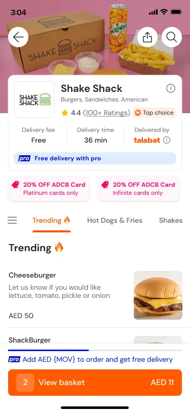
That is the design problem. Everything after it is the work of making one small component survive two platforms, two writing systems and every basket value a customer can reach.
The anatomy
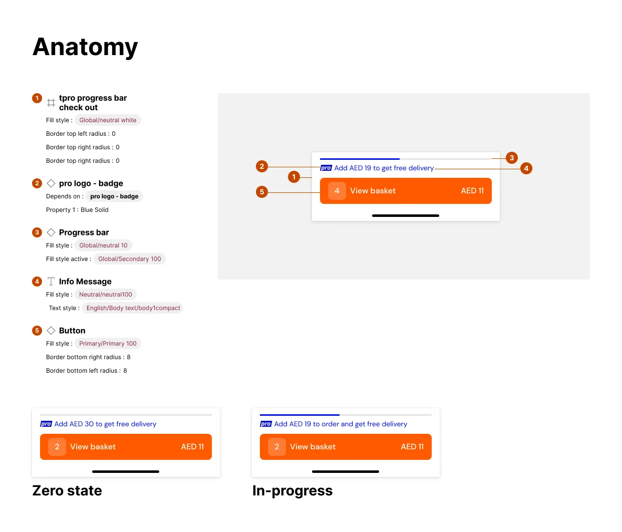
Every element resolves to the global library. The container takes
Global/neutral white. The track is Global/neutral 10 and fills to
Global/Secondary 100. The message is Neutral/neutral100 in
English/Body text/body1compact. The button is Primary/Primary 100, with
radii of 0 at the top and 8 at the bottom because it docks to the screen edge.
Two of the five are not drawings. The Pro badge and the bar itself are instances depending on components someone else owns, recorded on the sheet so a change upstream has a known blast radius.
Spacing is a scale, not a number
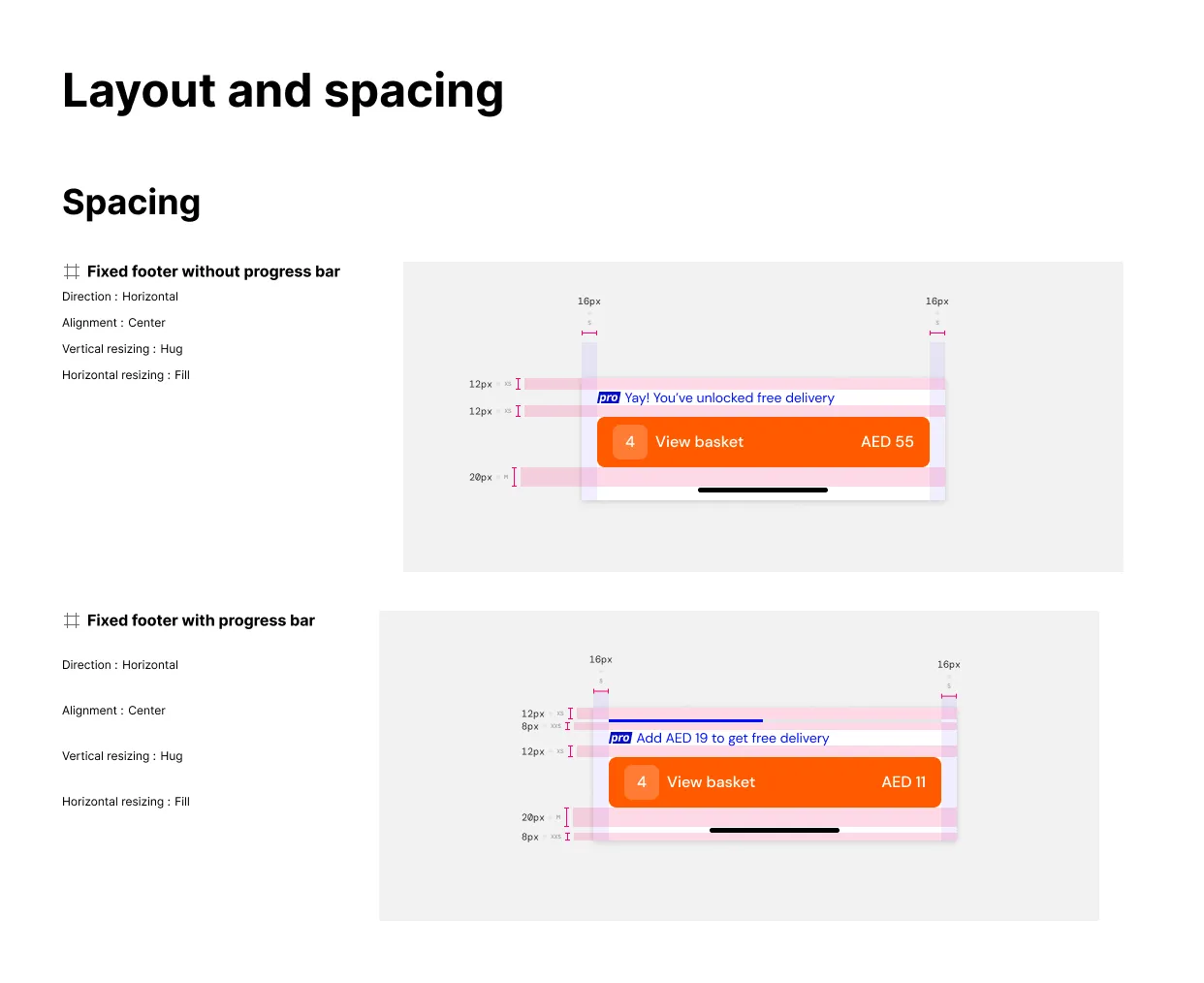
The margins are redlined as S, not as 16. A number in a handoff is a decision
someone repeats correctly on every screen. A token is a decision made once.
Acceptance criteria, because a state is not a picture
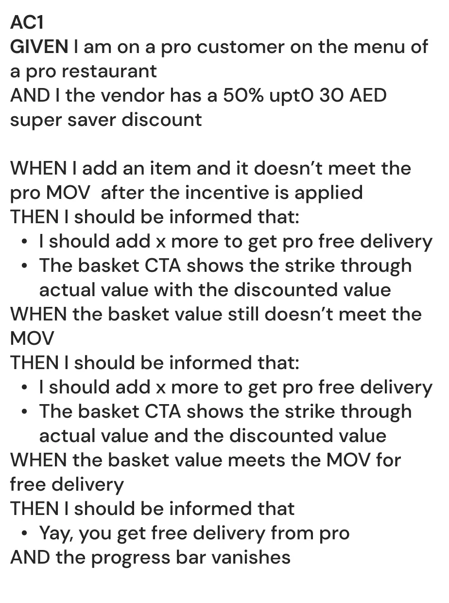
The bar has three outcomes and each had to be written rather than drawn, because the discount interacts with the threshold:
- The basket does not meet the minimum once a super saver discount is applied. The customer is told how much more to add, and the CTA shows the struck-through original beside the discounted value.
- The basket still does not meet it after more items. Same message, updated number.
- The basket meets it. The customer is told free delivery is unlocked, and the bar vanishes.
That last clause is the one that gets missed. A progress bar that reaches the end and stays on screen is a component still asking for something it already has.
Motion and the Arabic mirror
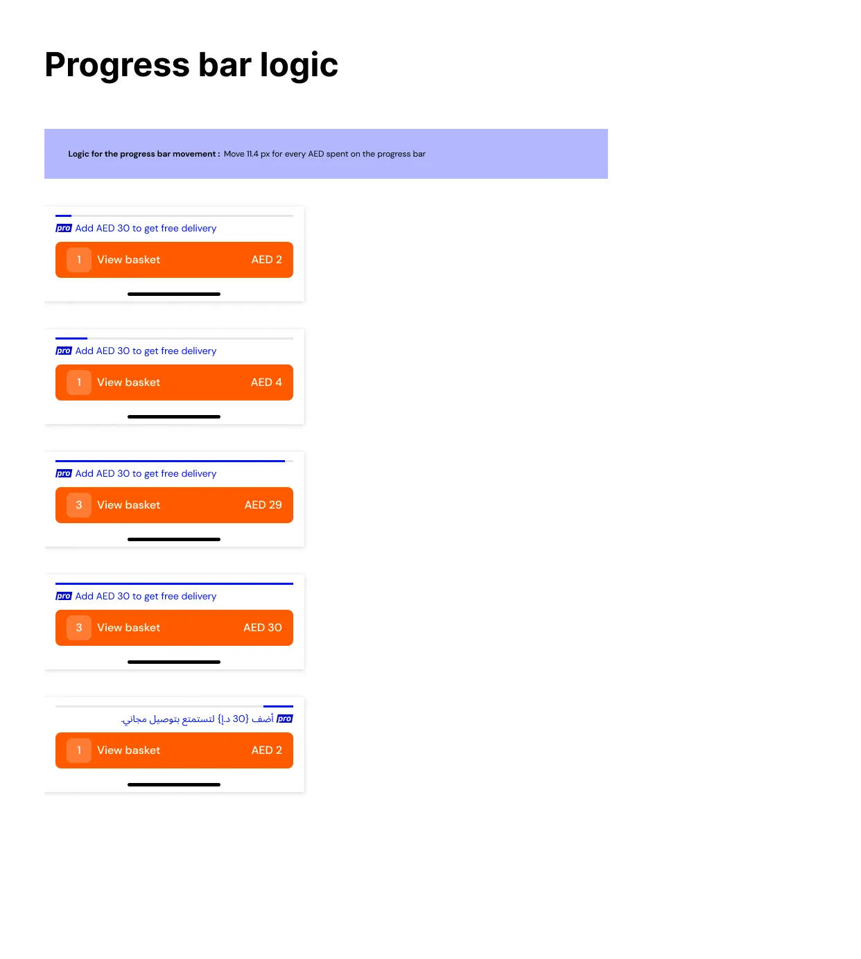
Between states the bar moves 11.4px for every dirham. Writing the rate down rather than the endpoints meant the fill was correct at every basket value, not only at the two I happened to draw.
In Arabic the message and the badge swap sides, the fill runs from the right, and the text style changes to the Arabic scale rather than reusing the English one. Specifying it beside the English version rather than in a follow-up is the difference between a mirrored layout and a translated one.
Two hard calls inside one small component
Working with engineering on a release cadence
On mobile the specification is the deliverable, and the release cadence is why.
The acceptance criteria were written with engineering, not handed to them. The three basket outcomes came out of a conversation about what the basket actually knows at each point. The discount interaction, which is the part that would have broken, surfaced in that conversation rather than in QA.
Upstream dependencies are named on the sheet. The Pro badge and the bar are instances of components another team owns. Recording that on the specification means a change upstream has a known blast radius, and it tells the engineer which parts are mine to change and which are not.
One review before the build, one after. Before, we walked the sheet together and I answered every question in writing on the sheet itself so the answer outlived the meeting. After, we compared the build against the states, in both writing systems, on a real device rather than a simulator.
Arabic is reviewed by someone who reads Arabic. A mirrored layout that a non-reader signs off is a layout that is mirrored but not right. That check is part of the definition of done, not a follow-up ticket.
The fix lands in the component, never on the screen. A Flutter build waits for an app store review, so the temptation to patch one screen is real. Patching the screen is how a component ends up with four versions.
Why this is the sheet I would show
It is the smallest thing in the project. It is also the one where every decision is written down: what each part is called, what it binds to, how it spaces, how fast it moves, what it says in three situations, and what it does in a second writing system.
On mobile that specification is the deliverable. A web component can be fixed in an afternoon. A Flutter build ships to an app store and waits.
Revisions
- Δ1
- Anatomy numbered, every element bound to a named global style.
- Δ2
- Spacing redlined against the spacer scale rather than typed as numbers.
- Δ3
- Movement defined as a rate, so engineering did not invent one.
- Δ4
- Acceptance criteria written for all three basket outcomes.
- Δ5
- Arabic mirror specified beside the English, not after it.