Sheet 01 / 04
IndexMichelangelo
Picasso keeps the skeleton. Michelangelo provides the skin.
Tellius had a working React component library and a product that looked like eleven different products. Michelangelo is a token layer that re-skins the whole surface without asking engineering to rewrite a single component.
- Client
- Tellius
- Product
- AI analytics: Vizpads, Kaiya chat, Missions
- Year
- 2026
- Scope
- 47 component sets · 116 semantic tokens · 54 icons · 30 chart types
Impact at a glance
- semantic tokens, replacing direct palette references
- 116
- stroke colours consolidated
- 226 → 3
- inline styles removed
- 338
- chart types restyled
- 30
The situation
Tellius ships an analytics platform: dashboards its users call Vizpads, a chat assistant called Kaiya, and scheduled jobs called Missions. The React library behind it, Picasso, was healthy. The surface was not.
Screens built in different quarters had drifted apart. The same neutral grey existed at several slightly different values. Stroke colour in particular had sprawled to 226 distinct values across the file, most of them one character apart and none of them named. A visual refresh was wanted, but a rewrite of the component library was not on any roadmap, and would not have survived contact with a shipping product.
From the docs
Picasso keeps the skeleton. Michelangelo provides the skin.
That sentence became the constraint for everything after it. Michelangelo was allowed to change how a component looked. It was not allowed to change what a component is, what it is called, or the props an engineer already writes.
Before and after
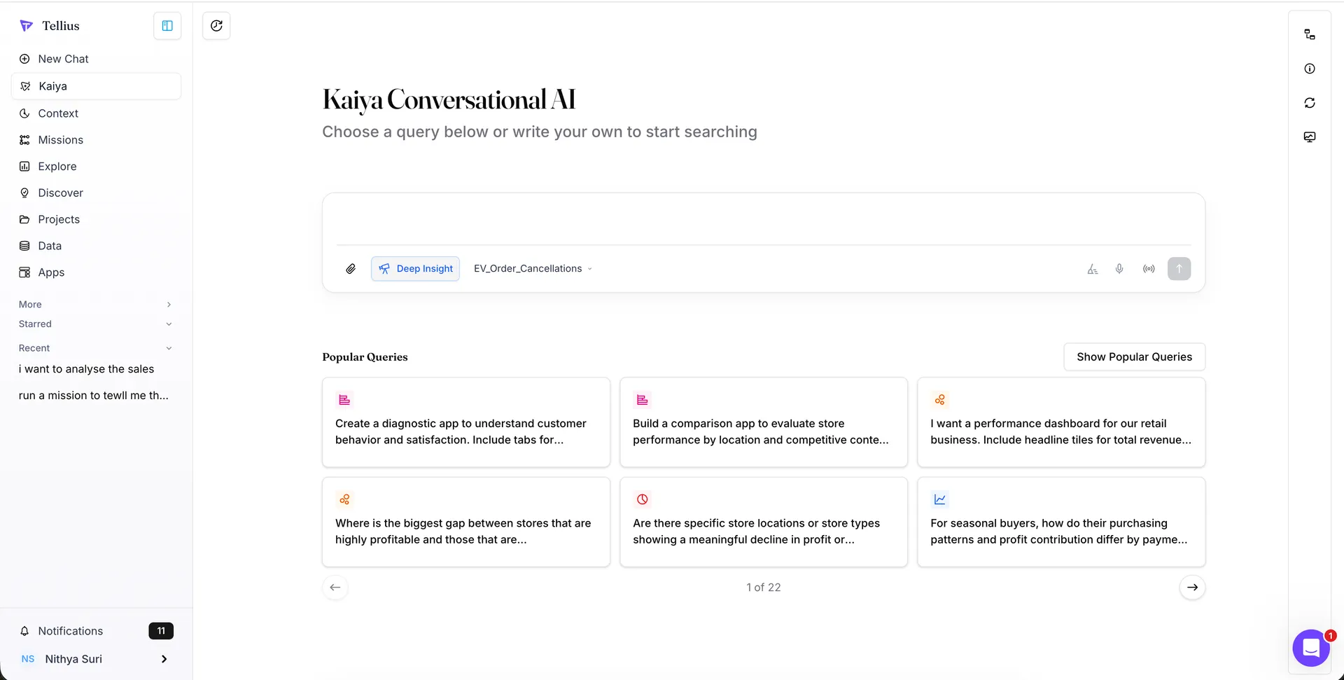
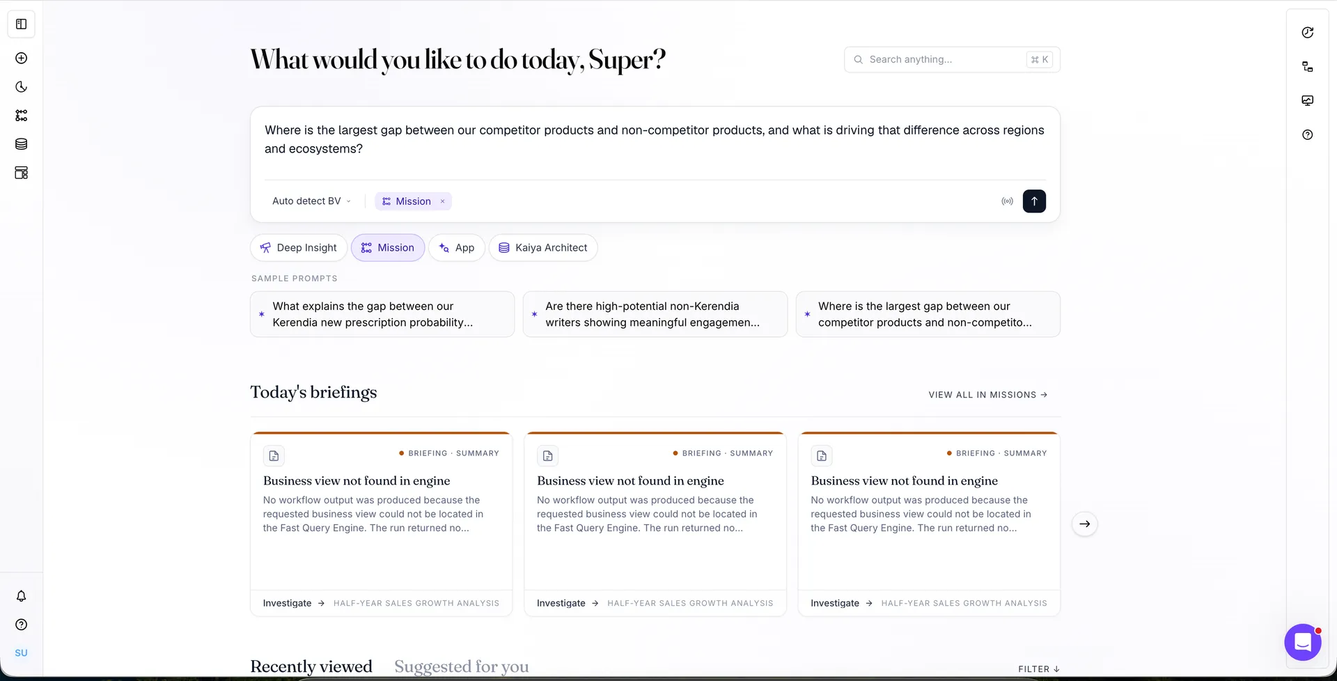
Before · Kaiya as it ships
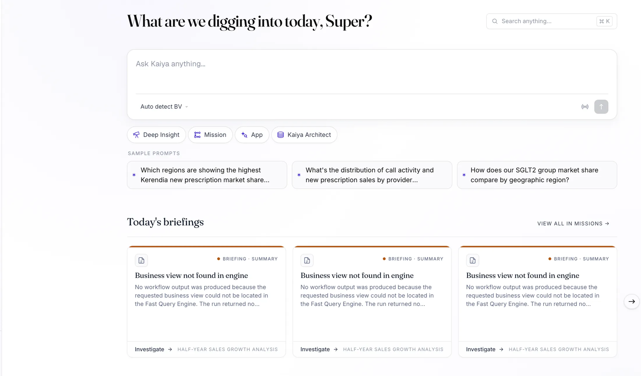
After · the same screen on Michelangelo
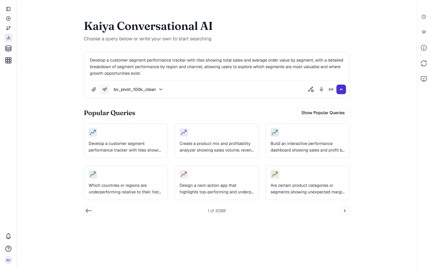
- The type changes. The heading takes the display serif; everything else moves onto the named text styles.
- The colour changes. Blue accent and unrelated icon tints become one primary role and a tinted set bound to the visualisation tokens.
- The rail collapses to icons, which is the only structural move in the frame, and it was made by the product team, not by the skin.
- Nothing else moves. Card size, gutter, corner radius, control height, pager placement and the button on the right are all untouched.
Only fonts and colour move
The reason a re-skin could ship at all is that it was allowed to change two things and nothing else. Type and colour were in scope. Geometry was not.
That means the button styling is the same button. The md control is still 32px
tall with the same padding and the same radius, and the set still carries four
levels, five states and three sizes. What changed is what those states resolve
to: a named primary role instead of a hex someone typed in a quarter nobody
remembers.
One state did get a rule rather than a value. Disabled is a flat token rather than an opacity, because opacity fades a nested icon and its label by different perceived amounts and the control ends up looking broken instead of inactive.
Holding geometry fixed is what made the change reviewable. A pull request that moves a colour token can be read in a minute. A pull request that also moves padding is really a layout change, and it will be argued about for a week.
The span ladder is the rule in one line: 888 for a heading, a composer or a table, 736 for assistant body, 584 for a user bubble, 432 for a chart card, 280 for a prompt card, 204 for a filter. Prose stops at ten columns even inside a container that spans twelve. That is why the answer text never runs the full width of the conversation.
Two collections, one direction of travel
The whole system is an argument about direction. Values may only flow one way: raw ramps sit in a primitives collection that is hidden from publishing, the semantic collection aliases them, and components bind semantic tokens only. Never a primitive, never a raw hex.
Hiding the primitives is the intricate part, and the part that makes the rest enforceable. A palette that is visible will be bound directly, by someone, in a hurry, and the day it is retuned that screen breaks silently. Fifty two raw values live in one place where only the system editor touches them. The 116 semantic tokens each name a job and carry a description in the variable panel, so the picker teaches the rule while it is being used.
Colour, role by role
Reading the board top to bottom is reading the thought process. Text has six
working steps because an analytics screen has six real levels of voice, from a
metric value down to a disabled hint. Surface has a separate hover and
selected because a row that is pointed at and a row that is chosen are
different statements, and before this file they were the same grey. Border gets
four roles because 226 stroke values collapsed into hairline, divider and ink,
plus the one focus colour.
The violet accent is deliberately scarce. It means interactive, and it appears in six states of one hue rather than six hues. That restraint is what keeps a dense dashboard readable.
Data visualisation is its own colour system
An analytics product lives or dies on its charts, so the visualisation palette is not the UI palette reused. It is a separate token family with its own logic, built to answer three different questions.
The categorical set runs to twelve series in a fixed order, and the order is the specification: series five is the same hue on every chart ever drawn, which means a reader can carry a colour from one screenshot to the next and still be right about what it stands for. Measures go further and bind meaning, not position. Revenue, volume and rate each own a colour, so two charts about revenue agree before anyone checks.
The icon layer
Icons are where a system tends to fall apart, mostly because nobody audits them. The audit here found 338 inline vector copies pasted across the file, drawn at whatever weight the day had produced.
The binding is what keeps the set consistent over time. Stroke weight resolves to
stroke/icon and the canvas to the size/icon scale, so an icon that gets
resized cannot drift to a different visual weight. Colour may be overridden per
instance. Weight may not. That is the entire policy, and it fits in one
sentence of the documentation.
Typography is two voices, not one font
The intricacy is in who is allowed to talk like what. Fraunces, a serif with
real optical sizing, is reserved for the product’s voice: greetings, insight
questions, the sentences Kaiya writes. Geist runs the working interface,
buttons and tables and labels. Geist Mono carries data, dates and identifiers
in tracked uppercase. So a user can tell, before reading a word, whether the
product is speaking to them, offering them a control, or citing a value. Two
smaller decisions on the same board matter more than they look: interface headings sit at
Medium rather than SemiBold, and body copy reads through text/body rather
than text/primary, because near-black at heavy weight is how dashboards end
up shouting.
Designing the surface where the product reasons
Tellius is an analytics product whose main interface is a conversation, and a conversation with a model is a trust problem before it is a layout problem. Three decisions carry most of the weight.
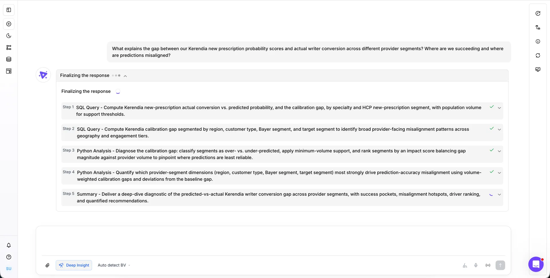
The plan is shown before the answer. A question does not disappear into a spinner. Kaiya posts its working plan as numbered steps, SQL first, analysis second, summary last, and each step checks off as it completes. A reader who can see step three running trusts step five’s conclusion differently.
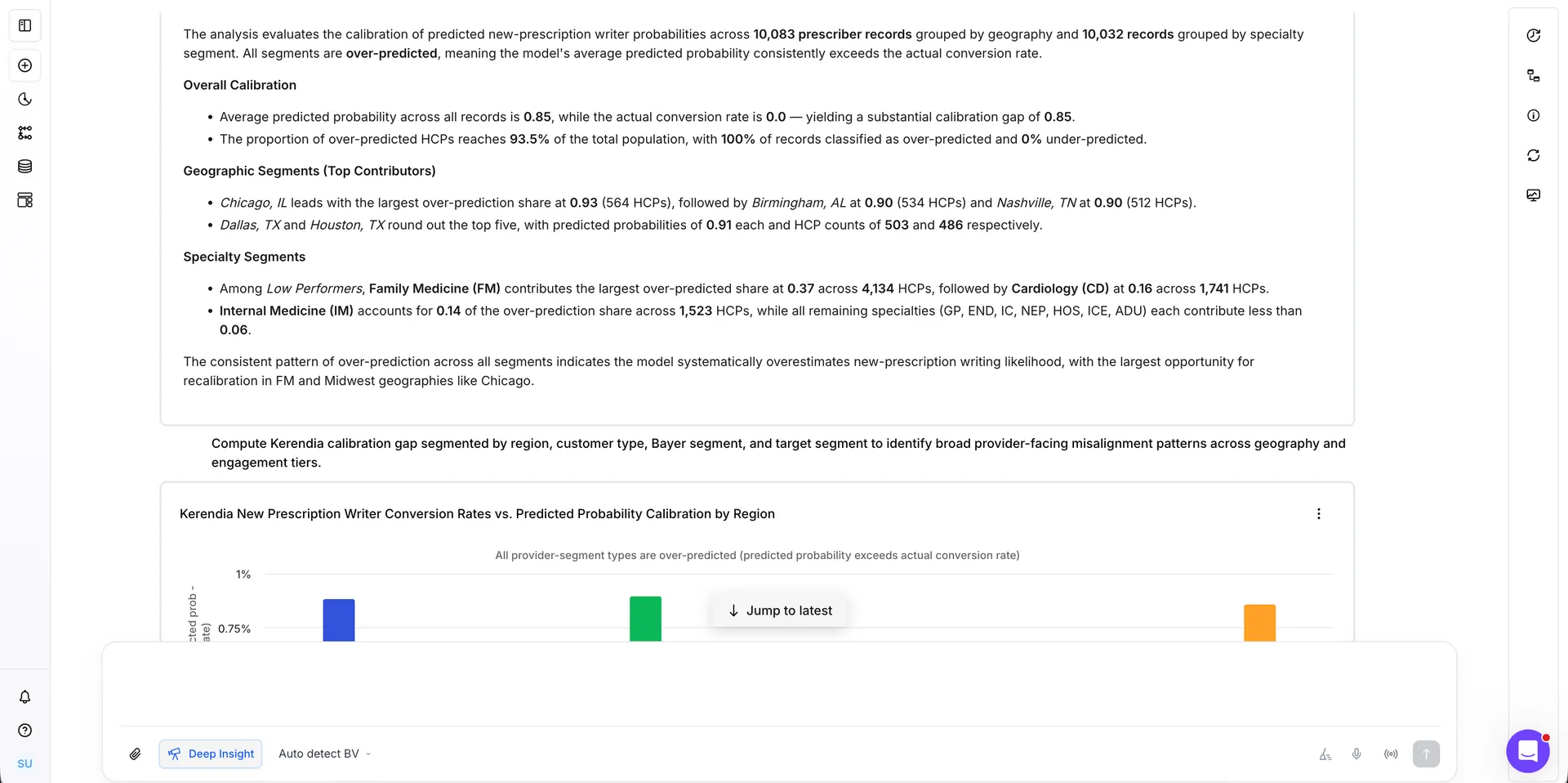
The answer is typeset, not dumped. Model output arrives as an editorial page: headed sections, bold figures, italics for named places and segments, every claim carrying its number. The same charts the dashboards use render inline in the thread, on the same visualisation tokens, so the conversation and the Vizpad agree about what revenue looks like.
The voice is specified like a component. The content rules ship inside the system, with the same force as a token: the product says you and your, never we. Eyebrows are tracked mono uppercase. While the model works the status reads reasoning, never thinking and never loading. And a banned list keeps the marketing register out of an analyst’s tool entirely, no unlock insights, no magic. For a product built on a model, that restraint in the copy is a large part of why people trust the numbers.
What changed
The collection came out at 52 primitives hidden from publishing and 116 semantic tokens in the one collection a designer sees, grouped so the names describe jobs: text, surface, border, accent, status, avatar, entity, viz, space, radius, font and grid. The foundations page keeps a live light and dark pair of the same card, so the tier two override is proven on the sheet rather than promised.
Stroke was the clearest win and the easiest to explain to engineering. The 226 values collapsed to three roles: a hairline, a stronger divider, and ink. Every one of the 338 inline styles that had been carrying a colour was removed and replaced with a bound variable. Without that, the mode switch would not have been possible.
Two grids govern layout rather than one. A workspace preset for dense surfaces such as Vizpads and dashboards, at 40px margins and a 1256 content width. A conversation preset for Kaiya, at 224px margins and an 888 content measure, where the governing rule is that prose never spans more than ten of the twelve columns even when its container spans all twelve.
The calls that could have gone another way
A system is remembered for its components, but it is decided in a handful of moments where more than one path was defensible. These are the three that mattered here, with the options that lost kept on the sheet.
What I would do next
Three things, in order. Measure adoption where it is measurable, which in Figma means library insertions and detach rates per component, because a detach is feedback, and it comes with coordinates. Retire the 25 reconstructed icons as their production assets land, so the gap ledger actually closes. And open a contribution path, so the next designer’s missing component becomes a proposal with a named reviewer rather than a local copy.
How it stays alive with engineering
A token layer that only lives in Figma is a mood board. The contract with engineering is what keeps it honest, and for Picasso that contract has three parts.
The variable collection is the source. Michelangelo lives in one Figma collection, and every component set binds to it rather than to a value. When a role changes I change it in one place and the file updates. Nothing is corrected screen by screen.
Storybook is where we agree. Picasso is a monorepo with a Storybook per package, so a token change lands as a pull request against the library and gets reviewed against the stories, not against a screenshot in a ticket. If a story looks wrong after a token moves, that is the review catching a mistake before a customer does.
A standing half hour, every week. Engineering brings anything that did not have a token, I bring anything that drifted. Two questions each time: is this a missing role, or a component using the wrong one. Most weeks it is the second.
The rule I hold to is that I do not file a design bug without proposing the token that fixes it. A bug report says something looks wrong. A token proposal says what it should bind to, which is a thing an engineer can merge.
Where it stands
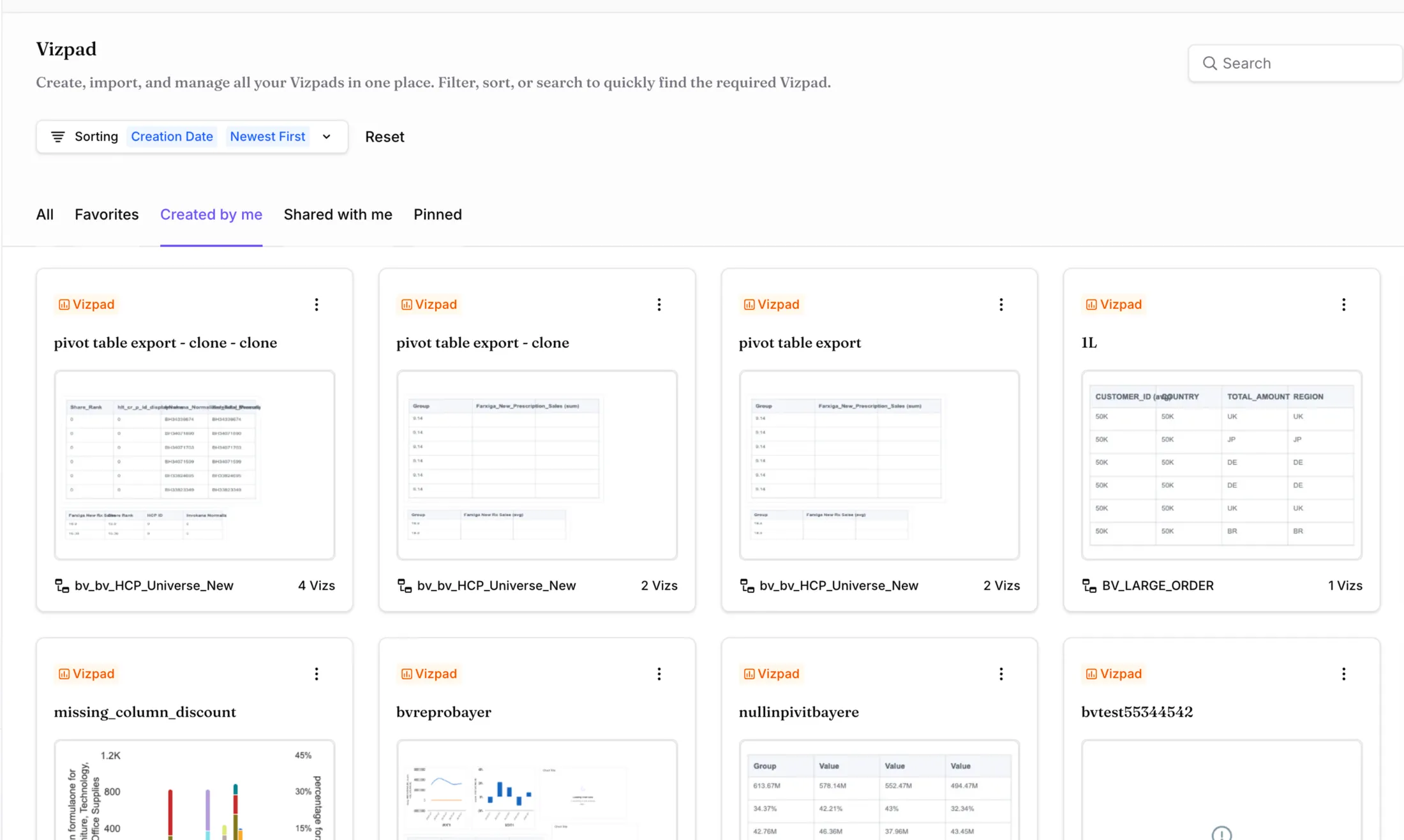
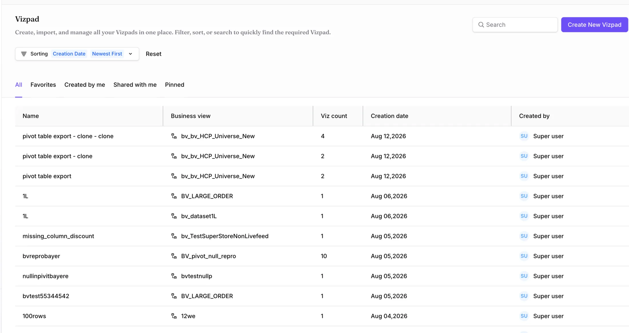
The Foundations and Components pages are rebuilt, the Vizpad surfaces are on the workspace grid, and the Kaiya chat screens are on the conversation grid. The component sets expose variant properties only, so text is overridden by the product rather than by the library, which keeps the contract with engineering narrow and stable.
Revisions
- Δ1
- Foundations page rebuilt on a single variable collection.
- Δ2
- Component sets rebound from raw hex to semantic tokens.
- Δ3
- Stroke palette collapsed from 226 values to three roles.
- Δ4
- Chart styling moved onto viz tokens, six categorical and four measure roles.
- Δ5
- Kaiya chat surfaces added on the conversation grid.